Look and Feel
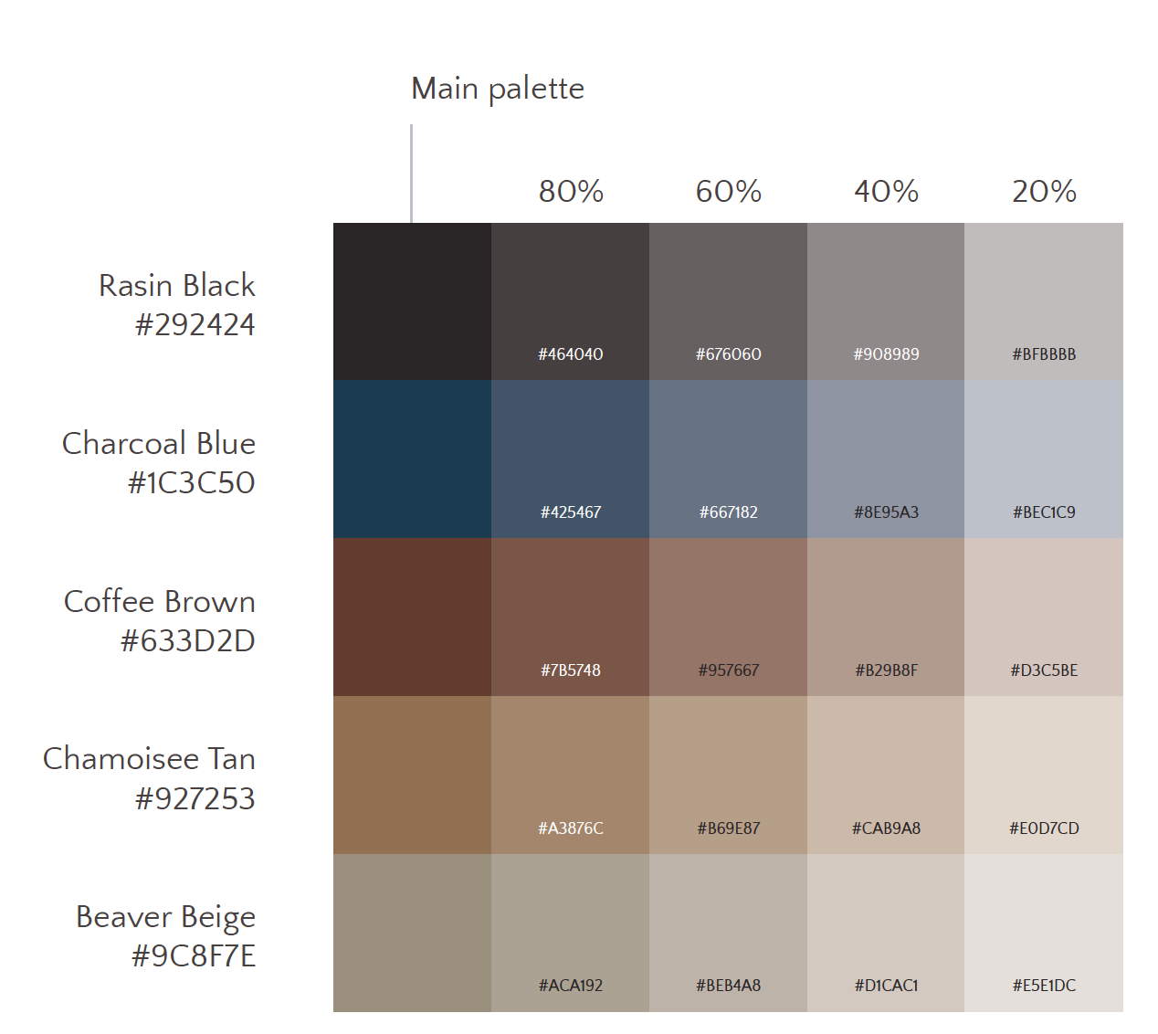
The overall aesthetic of Causeplay was decided very early on. My co-founders and I collaborated on what we felt would be the most impactful to our audience. Our color palette is inspired by a blend of cosplay genres. Some elements include high fantasy druid earth magic, weathered medieval armor, steampunk time traveling leather boots, and underground cyberpunk hideouts.
Ideation
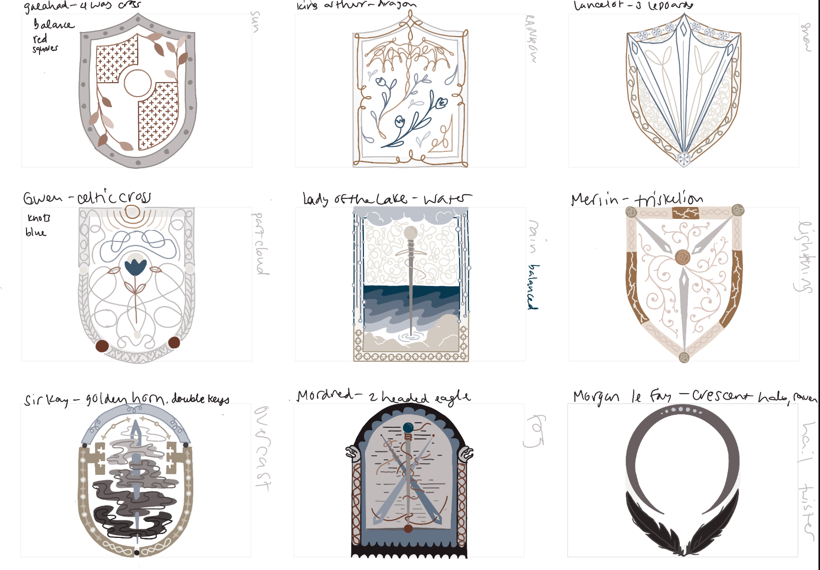
I used the color palette as a jumping off point to do some wild ideation for the logo. We already had the non-binary knight as a central focus, so as an exercise I put together a collection of shields for various characters around King Arthur's time. These sketches were foundational to the design of our final logo, which pulled many individual elements from each.
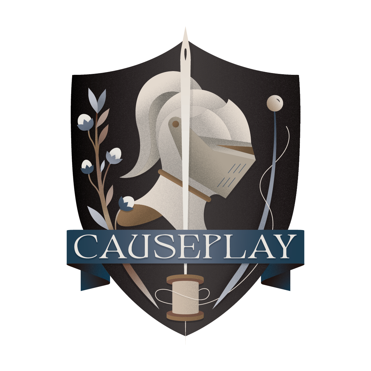
Some key takeaways from this step were the individual elements that I used to represent each facet of the company. They came to be known collectively as "the elements".
SHIELD — Defenders of the just, the weird, and the whimsical
NON-BINARY KNIGHT — Warriors of inclusion for all genders, sizes, and body types
NEEDLE + THREAD — Providers of finished goods and DIY materials
FLAX — Sourcers of sustainable, ethical, and renewable materials
PIN — Curators of resources for all levels of Causeplayers
NON-BINARY KNIGHT — Warriors of inclusion for all genders, sizes, and body types
NEEDLE + THREAD — Providers of finished goods and DIY materials
FLAX — Sourcers of sustainable, ethical, and renewable materials
PIN — Curators of resources for all levels of Causeplayers
Finalization
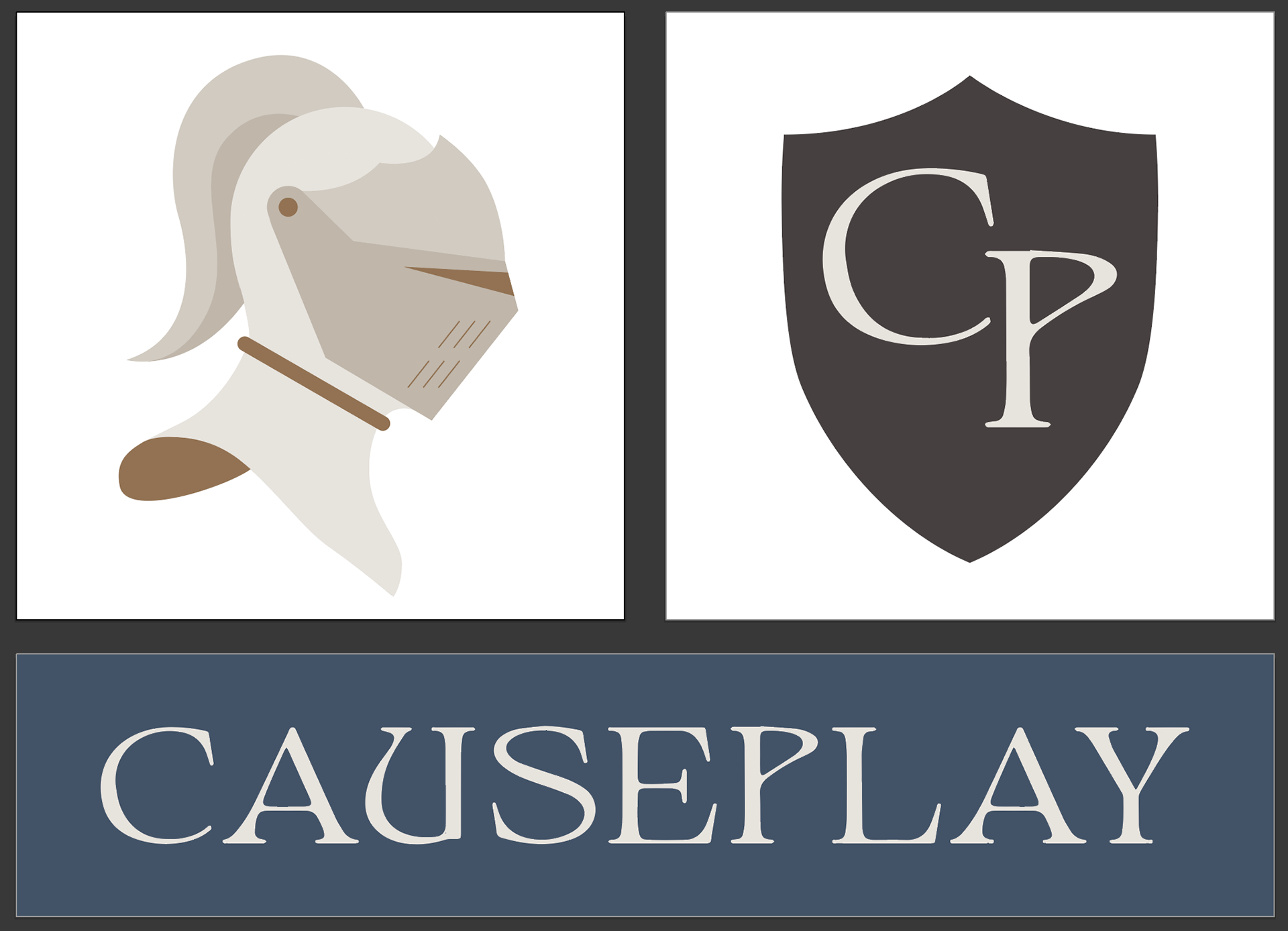
Once the main logo was completed, I worked on ensuring it was scaleable. Considering its complexity, I added iterations to the brand guide that allow flexibility for use, such as small embroidery or letterheads.
There are many changes to make, as we are a small, growing company, but my hope is that I have laid a foundation that will last.


