TabletopTown has ebbed and flowed so much since its inception that pinning down my actual role within the company is quite difficult. By the time I became a co-founder, roughly 35% of the app had been designed and built, so it already had a personality of its own.
Design Systems
With the logo set, I began building up the integral design systems we would need for core functionality (some of which turned out to be not so *core*) — the map system and the icons.
Maps
For the maps, our plan was to create a series of patterned ground textures that players could swap with a drag of their finger and place in any direction. With the help of Zelda and a little magic in Figma, we were able to create a prototype map that could create pretty much any battle map that a GM (that's Game Master) would need to show their players, with roughly 65 different layouts for edges, turns, and stops.
To my dismay, the map system has yet to be released for public use :(
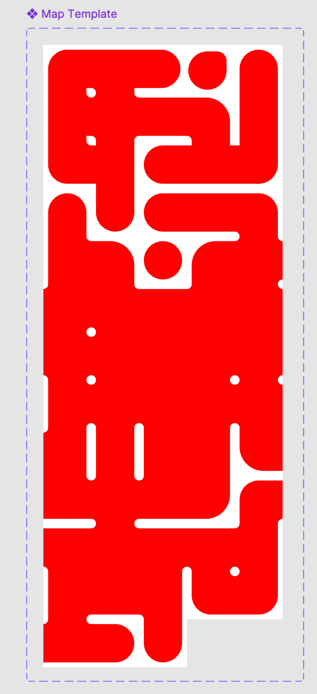
Map System -Master Template
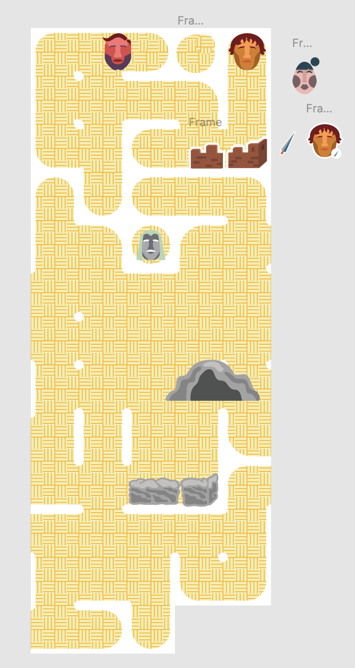
Map System - single texture fill with landmark stickers
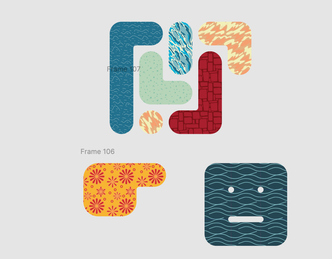
Map System - texture variation test
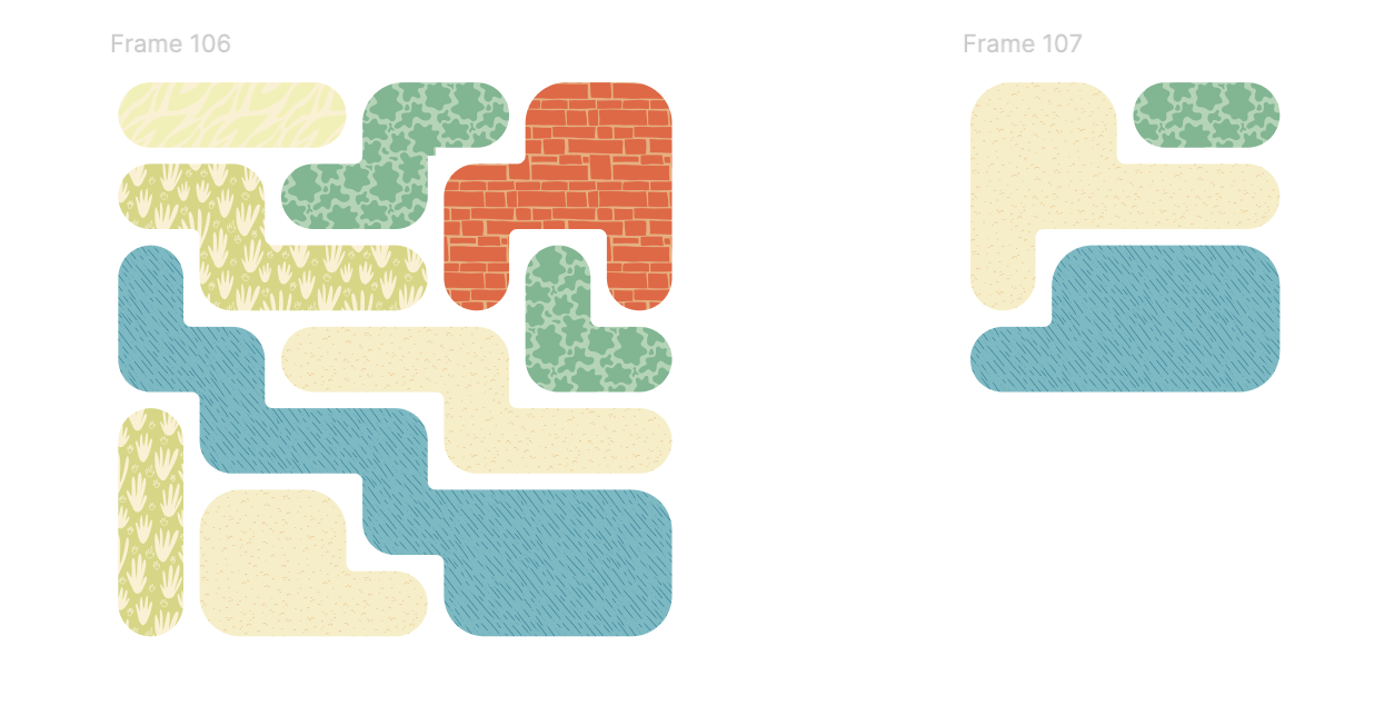
Map System - texture variation test
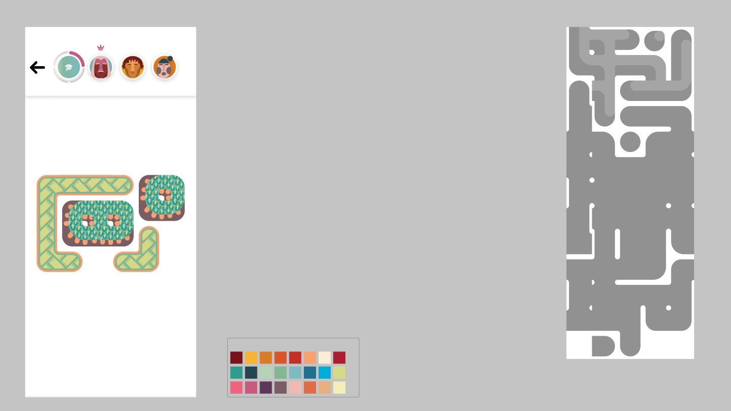
Map System - in-app map testing
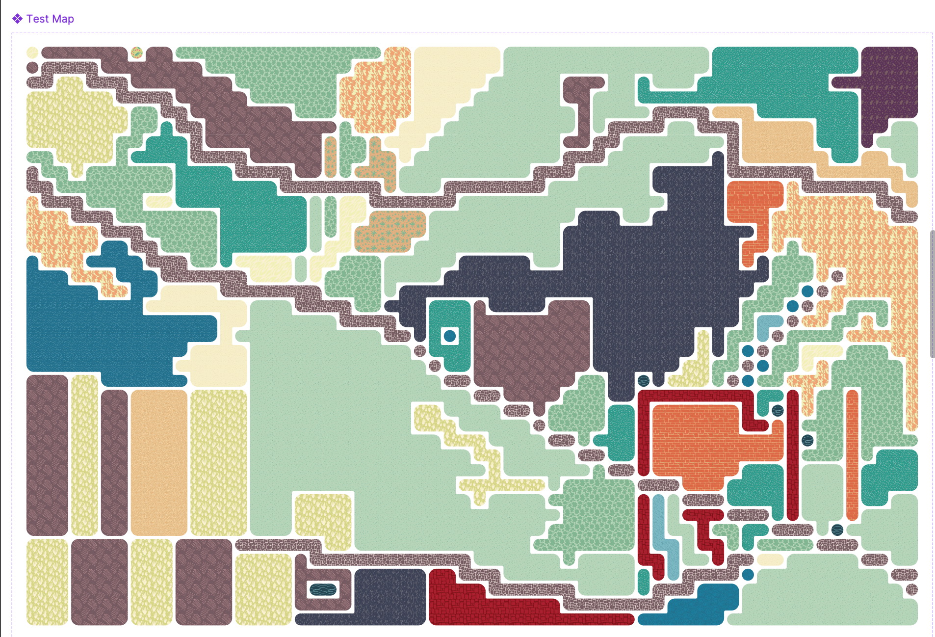
Map System - Recreation of Legend of Zelda video game map
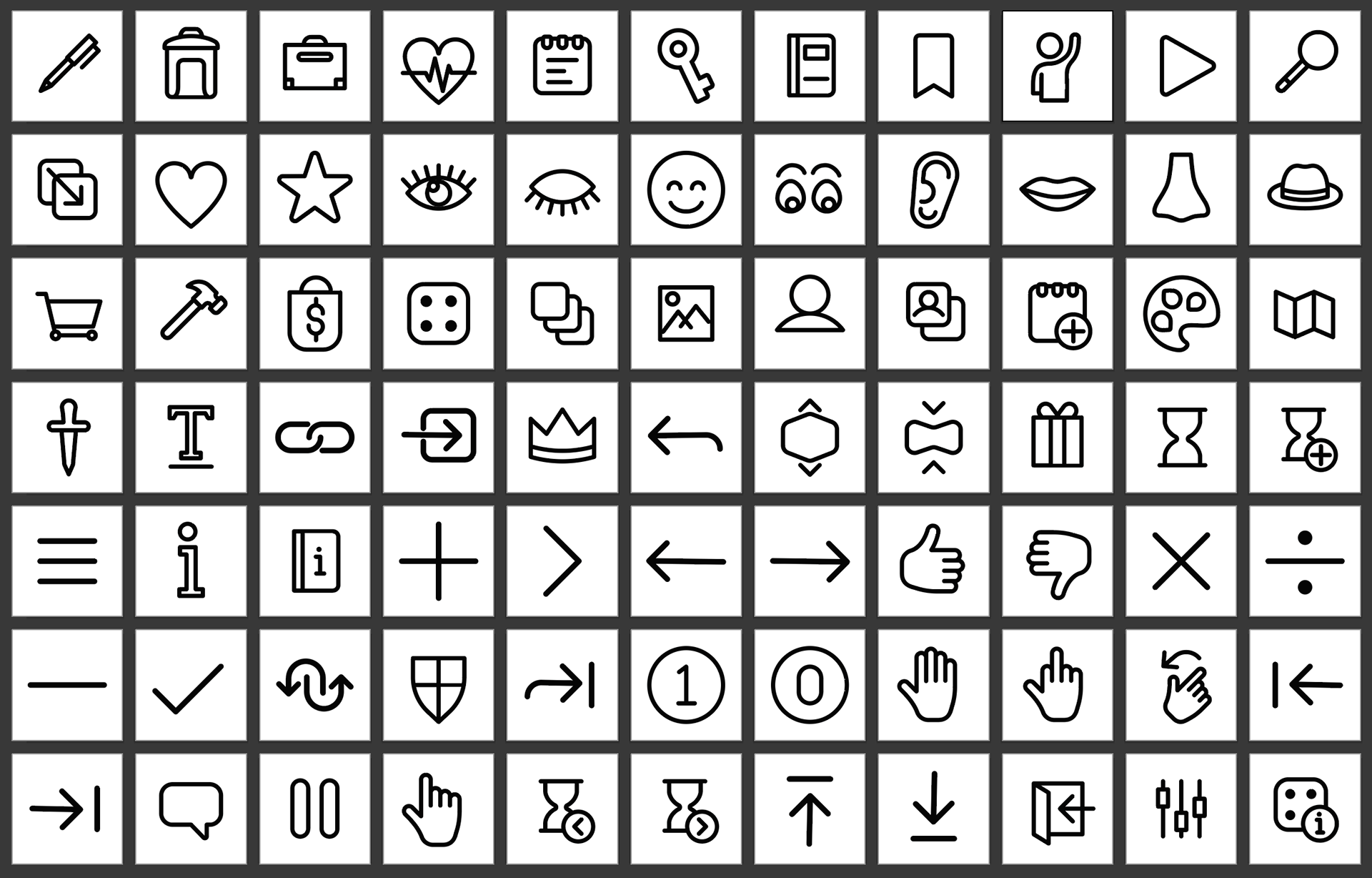
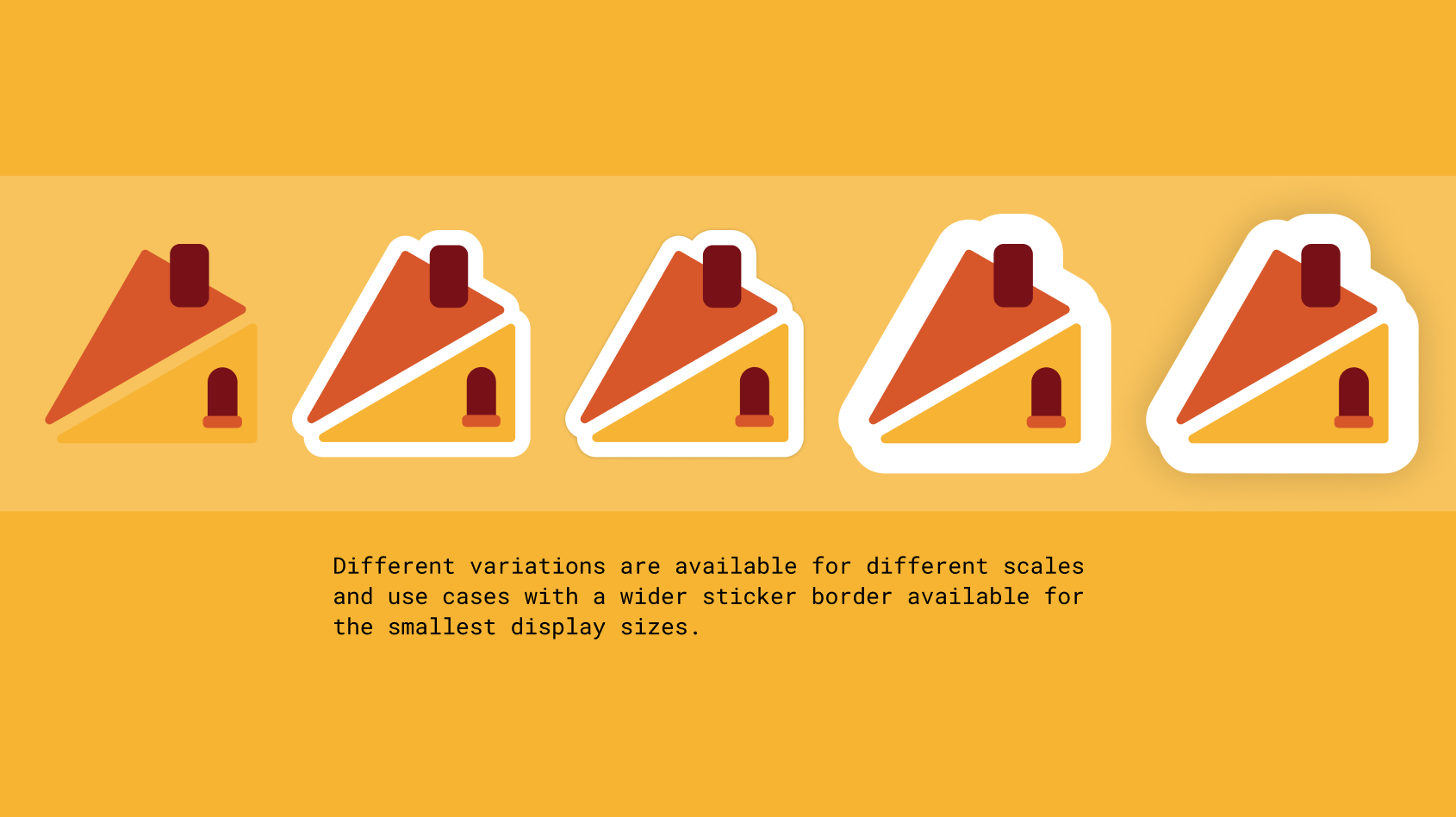
Icons
The other large design contribution I made was to the in-app icons. The most difficult part of this design system was ensuring their visibility on a mobile screen while keeping as much detail as I could. These little guys bring so much personality to the interface, I just love 'em!
